Chapter 1

What Makes B2B Websites Different from Other Websites?

b2b websites

When you’re designing a website, it can be tempting to draw stark black-and-white comparisons between B2B sites and other types of B2B web design. The truth is far more nuanced, rendering a picture in shades of gray; after all, each different type of website has some overlap, and something to learn from as well as a qualified B2B web design agency that can design & develop them.

B2B vs B2C Websites

Business-to-consumer (B2C) websites and their content are largely designed for and geared toward mass appeal. B2B marketing, on the other hand, is a niche concern. This shows itself in three key ways:

  • B2C marketing tends to be broadcast, while B2B is narrowcast. Your customer research, and the customer avatars that result, will be much more precise, and far more carefully targeted, rather than trying to be all things to all comers.
  • B2B has a longer sales cycle or customer journey—more on this presently—with less emphasis on impulse buying or emotional triggers.
  • In addition to our second point, it’s also worth noting that B2B content creation is an altogether different beast than B2C content; here, statistics, case studies, a robust knowledge base, and concrete solutions to problems that may require creative applications of innovative thinking tend to carry the day.
B2B vs ECommerce Websites

The prospective B2B web design client will go through many of the same steps that a B2C consumer does when researching, evaluating, and ultimately selecting a product, software, or service. While both types of business will find value in eCommerce, there are key differences in customers’ and end users’ experiences and expectations that set them apart. This is especially apparent in companies that cover both markets; a company like Dell, for instance, will pitch laptops to consumers in a different way than they would target businesses seeking servers or cloud computing services.

B2B vs Nonprofit Websites

At first blush, one would think that a nonprofit organization or charity is in many ways the complete opposite of the B2B marketing approach. What, after all, is a nonprofit organization selling? On the other hand, nonprofits’ focus on the greater good, community leadership, and an emphasis on service are all worthwhile to businesses, too.

When Unilever surveyed 20,000 adults worldwide to gauge customer sentiment toward their businesses, they found that 33% actively chose businesses with a sense of purpose. Nonprofit marketing, with its emphasis on storytelling that drives retention, also has much to teach profit-driven businesses.

B2B vs Governmental Websites

Many B2Bs are also B2Gs—Business to Government—making it important to understand what makes government websites tick. While the government can seem opaque and complex to outsiders, government websites need to make laws, regulations, initiatives, and even complexities like the tax code as transparent as possible.

To that end, government websites place a premium on three key principles:

  • Usability: Can the public easily navigate the site and find the information they need?
  • Development: Is the site mobile-compatible, accessible, and quick to load?
  • Information: Is the information present, clear, and engaging to the extent possible, without compromising or obscuring its intent?
The Takeaway: What B2Bs Can Learn from Non-B2B Websites

If we view each of these pairings as a both/and, rather than an either/or, what do we learn?

  • B2B sellers’ clients have sales headaches of their own. B2C websites’ emphasis on identifying and addressing pain points is instructive here, and businesses are slowly coming around to the value of emotion in building connections.
  • Traditional eCommerce websites remind us that removing friction points from the purchasing process is vital no matter who’s buying, or what they may be purchasing.

Nonprofit websites remind us that the heart matters as much as the head and that our clients aren’t simply buying a product or service; they’re investing in the promise of significant change. They’re also a permission slip, of sorts, to wear your business’s heart on its proverbial sleeve and emphasize your own organization’s social responsibility in business.

  • Organizational and governmental websites provide information, visibility, and accountability. They also remind us that our businesses often overlap with our clients’ legal and regulatory concerns; informing your prospective clients to better address those concerns, while also respecting privacy concerns and protecting your clients’ proprietary information, will be to your benefit as much as theirs.

There is one more component that each of these sites shares. Grab a compass; we’re about to embark on the customer journey.
Chapter 2

Know your B2B Buyer’s Journey

b2b buyers journey

Every journey has a hero, but behind the hero is a guide who helps them find their way. Dante had Virgil, Luke Skywalker had Obi-Wan Kenobi, and your customer has you. To be an effective guide, it’s necessary to know the stages of your prospective customer’s buyer’s journey.

That, in turn, means that you no longer have the luxury of guessing at your target audience, their personas, and what it will take to convert curiosity into a purchase. Instead, you must be standing by with content tailored to the time and place in which your customers find themselves.

What is the B2B Customer Journey?

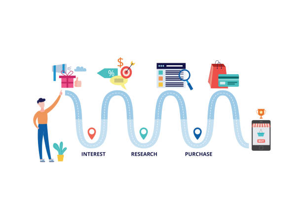
What are the stages a customer goes through when considering a purchase? There are multiple touchpoints, and the process won’t always be linear; it’s common for customers to skip ahead, or circle back, to different points in the process.

  • Awareness: Awareness is twofold, incorporating the awareness of a need on the one hand, and a budding realization of the available options on the other. At this stage, your company may not even be a dot on your customer’s horizon.
  • Consideration: Having identified a need and potential solutions, the focus begins to narrow to solutions. Here, your prospect is gaining awareness of products and services, specifications, and particular vendors, and is likely to have numerous questions.
  • Purchase: The purchasing process, rather than closing out the customer journey, is more akin to a rest stop. The search may be over, but as a vendor, your job is just getting started.

Retention: Now that the customer has purchased your product, they will be evaluating the experience and results against their expectations. This involves not only product quality, but also the kind of support received; delivering good service ensures a positive experience and a positive return on investment for your website.

  • Advocacy: If brand loyalty is valuable, brand advocacy is priceless. After all, advocates are not only loyal to your brand, but they will also actively recruit others to it.
Mapping and Guiding the Customer Journey

Once you have a better understanding of the customer journey, you’re much closer to being able to meet your customers where they are, and the better to give them the information they need to make an informed decision. But how do you tailor that information to the different steps in the process?

Know Your Goals

You can’t guide your customers before you know where you are going. Identify those goals and the metrics by which success will be measured.

Know Your Clients

Next, you will create buyer personas. A good way to do this is to research your market, building a profile based on your ideal customer. This will help you to understand where your clients are, the better to reach them; it will also help you tailor content to each step in their journey.

As a B2B, however, a better way to do this is to go a step further and research your clients’ clients. After all, you are not simply helping your customers; the solutions you offer should, ideally, assist them in solving their customers’ problems.

Map Their Journey

Now that we understand our ideal customer, we can review the touchpoints in the customer journey through their eyes. In doing so, we can better tailor the information we’re presenting at each step.

  • Establish authority in your niche to raise visibility during the client’s research phase.
  • Cut abundant or complex information down to size to prevent paralysis by analysis.
  • Present a clear USP; rather than competing on price, compete on solutions.
  • Ensure solid service and support during, and past, the sales process, providing an incentive to cultivate a long-term relationship.
  • Make it easy for your best customers to share their great experiences with others, drawing new fans to your brand and repeating the cycle.
Test Your Assumptions

You wouldn’t drive cross-country with a map from a decade ago. Similarly, you should not rely on an outdated map for the customer journey. Revisit your market research and resulting client avatars, test performance against KPIs frequently, and refine your processes constantly. Complacency isn’t the way to good business or optimized conversion rates.

Clearing the Way: Removing Obstacles from the Customer Journey

A few bumps in the road are inevitable on any journey, but as marketing managers and leaders, we have a responsibility to ensure that the occasional speed bump doesn’t turn into a pothole or roadblock. There are a few obstacles that should be addressed along the way for successful B2B web design.

  • The Wrong Information at the Wrong Time: Focus on quality data over a sheer volume. The right research on your part, and the right information furnished to your customers when it’s needed, will get you farther than an overload.
  • The Wrong Systems: Your new B2B website is only one component among many; your eCommerce system, CRM, email marketing, and every other tool at your disposal needs to integrate seamlessly, lest one broken or uncommunicative tool in your kit disables the others.
  • Lack of Buy-in: Your website is a sales tool, but it’s much more than that. Ensure that all stakeholders—not only sales and marketing, but also support staff and management—have had their say in designing an effective experience and delivering a unified, coherent message that converts or advances users to the next step in their journey.
The Takeaway: Summarizing the Customer Journey

At various points, we’ve spoken about your role as a guide and the importance of a map for the customer journey. That map—and the signposts your prospect will encounter through their journey—is drawn from a strong content strategy tailored to each of its steps:

  • Know your goals and align them to the customer journey.
  • Research your customers to ensure you reach the right individuals in the right places.
  • Research their customers, too, to better target your messaging.
  • Keep the path clear.
  • Test your assumptions against hard data, evolving your marketing and approach as demand and market conditions change.
  • Never forget that the sale is only the midpoint of the sales process; support and service drive retention and ensure that the customer journey isn’t a one-way trip.

Now that your customer’s bags are packed for the buyer’s journey, we can explore user experience (UX), which ensures the trip is an enjoyable one and at the core, you as the brand are sincerely helping them win at B2B web design.

Chapter 3

Successful UX Strategy for B2B Sites

ux strategy

Research shows that we form first impressions of people within seven seconds of meeting them. Your website has no such luck; as Forbes notes, it may have as little as 50 milliseconds to entice someone to click through.

The odds may seem stacked against you, but if you understand user experience, you can begin to claw some of that time back. There is only one catch: there’s some disagreement as to what UX is, exactly.

Nevertheless, given the importance of UX design to your site’s performance, you owe it to yourself and your business to understand and implement user experience research.

What is User Experience?

In a general sense, UX is how someone experiences your website, how long their visit lasts, and the activities they perform in that time. As we’re about to see, it’s equal parts art and science, combining visual elements with psychology, sales, and more, tailored to your B2B web design.

The Place of UI in Designing an Effective User Experience

To the layperson, UX is interchangeable with UI, or the User Interface. They aren’t. Here, it’s useful to think of UI as the site’s body—not just text, but also navigation, calls to action, pop-ups, chatbots, and the like—and UX as its heart. Jakob Nielsen identifies ten usability heuristics for UI design that, in turn, will elevate your customers’ user experience and your B2B web design.

  • Visibility of system status, so your user always knows where they are
  • The use of common language and real-world conventions instead of industry jargon
  • Consistency with industry standards for the web, as well as internal consistency among pages on-site
  • Clarity and simplicity in design that prevents errors, as well as provide fail-safes, helping users recover quickly when an error cannot be avoided
  • Reliance on recognition rather than recall using proven design standards, offering easy access to contextual help, documentation, and human assistance where needed
  • Allowing for degrees of flexibility and customization that ease use for your inexperienced users and most-frequent customers alike
How Does UX Relate to SEO?

Search engine optimization used to be composed primarily of the different ways in which keywords could be deployed on your site. Now, however, there are far more factors that play into your place in the search results, and many of them are derived directly from UX.

  • User intent
  • Time on site
  • Bounce rates
  • Click-through rates
  • Overall site quality, summed up in these and other metrics
Five Fundamentals of Good B2B UX

You will recall that B2B marketing is distinct from B2C marketing. As it happens, there are significant differences in B2B shoppers’ user experience, and five of them are particularly deserving of attention.

  • B2B purchases tend to involve multiple stakeholders. The buyer may not be the decision-maker, so your design and content must be capable of communicating with several organizational levels at once.
  • Similarly, the businesses to which you are selling have a business or consumer customers of their own. Giving your customers the tools to assist their customers’ challenges establishes trust and authority.
  • B2B purchases unfold on a longer timeline rather than impulse. Devise your content with the stages of the customer journey in mind, with particular emphasis on specifications, comparisons, and other common customer criteria.
  • Remember that few purchases take place in a vacuum. Your product or service will, often as not, need to support or integrate with existing processes and equipment, and your content must address those needs.
  • While the psychology of pricing may be subtly different for businesses, it’s still important. Ensuring that price information is present (even if only as a guideline) and transparent is vital.
Benefits of UX Optimization

An effective UX rewards customers who, in turn, will reward your business. How can you and your B2B web design benefit?

  • Because it takes time to plan a site around your customers’ needs, good UX shortens development time.
  • Intuitive design and navigation help to limit frustration, good UX limits customer service issues.
  • A site that eliminates pain points like mobile incompatibility, poor security, or complex forms helps to remove friction, good UX improves conversions and referrals alike.
The Takeaway: What’s the ROI of UX?

What might those benefits look like in practice? Three key metrics deserve attention.

  • Marketing Spend: Increasing conversions by 10% is money better spent than spending more to attract leads only to convert at a lower level.
  • Bounce Rate and Time on Page: Bounce rate is the number of visitors who leave your site without viewing more than one page. Time on Page tracks customers who click to another page, only to leave shortly thereafter; you may not have given them the right information or enough of it.
  • Integrations: Good UX may start with your website, but it shouldn’t end there. Integrating your site with your CRM and other SaaS services you’re running from the cloud improves follow-up that helps to nurture new leads and aids in retaining existing customers.

Up to this point, we’ve talked about a fair amount of theory. It’s time to start putting that theory into practice with an effective B2B web design process.

Chapter 4

Leveraging a Proven B2B Website Design Process

b2b web design process

Some of the steps that follow will apply more to a redesign than to a site built for a new business, or a website built for a B2B tech startup, but many of the others are universal to any effective B2B website design.

Step One: Establish a Baseline

Begin by establishing some benchmarks on your current site using Google Analytics or any marketing automation software you use. We’ll have more to say about core web vitals shortly, but in the meantime, we suggest examining site performance metrics to see what needs attention, and to gauge the improvements offered by your new B2B web design.

  • Pageviews, visitors, and unique visitors
  • Bounce rate and time on site
  • SEO rankings for your key search terms
  • Form submissions and quality of lead generation
  • MQLs and SQLs generated
  • Conversion rate
Step Two: Establish Your Goals

A B2B web redesign without a clear purpose will not serve your customers or business. Understanding what you seek to achieve—increasing visibility, improving conversions, and building a stronger foundation from which to pivot to new markets—will help you identify the tools and techniques that will get you to your destination.

Step Three: Audit Your Content

Most of us are familiar with the Pareto Principle, also known as the 80/20 rule, which states that 80% of your outcomes will be driven by 20% of your effort. This is especially clear with content creation, where a small number of pages will drive the bulk of your views, clicks, and shares. Evaluate your content’s efficiency against your benchmarks, the better to identify content that drives growth.

Step Four: Audit Your Customers

This is the perfect time to revisit the customer journey we discussed in Chapter Two. This involves not just understanding the buyer’s journey in the abstract, but truly getting down to a granular level of buyers’ needs, desires, and behaviors.

Step Five: Check on Your Competitors

Every business has one or more rivals with which they compete for customers’ attention and money. What can you learn from their sites’ designs, UI, and content? This can be something of a balancing act; on the one hand, we want to double down on what works, but on the other, we also need to differentiate ourselves. Doing this effectively requires an understanding of our competitors.

Step Six: Lean into Your UVP

Once you have a thorough understanding of yourself, your customers, and your competitors, you will be in a much better position to identify and leverage your UVP, or Unique Value Proposition. Knowing what you do differently, and better, than anyone else will guide the design and building of your site, the content that populates it, and so much more.

Step Seven: Address the Fundamentals

As with the core web vitals we discussed earlier, we’ll be addressing the key functional elements of a B2B website design presently. However, it’s worth briefly reviewing a few of the essentials:

A brand “bible” that keeps your branding and identity, content guidelines, web accessibility standards, social media policy, and other essentials close at hand

  • A wireframe that standardizes UI items like page layouts, navigation, and CTA placement
  • Quality content that’s designed to inform and convert
  • Calls to action that capture or qualify leads, or drive buying behavior
  • Landing pages and forms that work in tandem with your PPC and other advertising efforts
  • Tools that encourage sharing of your site and its content
  • Responsive design that ensures a good UX across multiple types of devices
  • Analytics to track results
Step Eight: Future-Proof

To the casual observer, a B2B website may seem like a static thing. It shouldn’t be. Your content should be ever-evolving, changing to adapt to market forces, customers’ needs, demands, and trends within your industry.

To that end, develop a content strategy encompassing text, video, infographics, and other key collateral, the better to keep your site as dynamic as your business for many years to come.

Step Nine: Test, Refine, Repeat

Just as web content should not be set in stone, neither should your assumptions about its utility and performance. Revisit each step in this process periodically, refining content and procedures to ensure that your site is constantly firing on all cylinders.

The Takeaway: Design from Thought to Action

On one level, B2B web design is aspirational, an expression of lofty thoughts and goals. Understanding the B2B web design process, and approaching it with purpose, is how your web design team works with your business to translate those thoughts and ideas into action items, and results.

Chapter 5

Key B2B Website Features

b2b website features

B2B web design is not, or is not only graphic design. While we will grant that you want a site that is clean and attractive, it’s equally safe to assume you do not want the equivalent of a pysanka, attractive on the surface but ultimately hollow inside.

Since our goal is to ensure the right balance of form and function, let’s look at some key B2B website features.

Content

Like any other cliche, there’s truth in “content is king.” The collateral required for an effective B2B site takes many forms, and it pays off to cover all the bases.

  • Text: Effective copy underpins everything you do, from spec sheets to SEO. The impact of a well-timed and elegantly phrased line isn’t just for literature; it’s good business.
  • Blog: Yes, we know, a blog consists of text. However, in contrast to your web copy, which may go for extended periods without changes or revisions, your blog is an ongoing snapshot of your business right now: its activities, its priorities, standing in the industry, and the many ways in which it can serve clients and community alike.

Images: From photos of staff members to infographics, hero images, project portfolios, and product photography, images convey information faster and more visceral than text can.

  • Videos: Video converts at a higher rate than text or photos alone. Anything that text and stills can do, video can do as well or better.
  • Email marketing: From email blasts to new product alerts, newsletters, or recall notices, email plays its part in promoting your business, reinforcing authority, and delivering great customer care.
  • User-Generated Content: UGC takes many forms, but the most common are reviews, testimonials, and case studies. Together, they provide social proof that is a powerful testament to your business’s capabilities.
  • Other Key Content: Audio, interactive timelines, gamified content, event calendars, interactive maps, and many other features provide opportunities for engagement.
Landing Pages

A typical website is a potpourri of varying purposes and types of content. A landing page is altogether different and more single-minded. Created with a single campaign in mind — social media marketing, PPC, or search engine marketing, for instance — its form and content are geared toward obtaining leads or closing a sale.

Forms

Forms take many forms. Each fulfills a different purpose for your clients or business, so each solicits different kinds of information as a result:

  • Contact forms
  • Agreements and contracts
  • Subscriptions
  • Consultation requests
  • Customer feedback
  • Maintenance and service requests
  • And more

The goal here should be to prioritize what is useful rather than collecting a mere volume of information; longer forms tend to scare off or frustrate customers, so ensure that the information you’re gathering will improve outcomes for everyone involved.

Calls to Action

There is a reason that the call to action, or CTA, is the backbone of inbound marketing. Even a poorly designed website will typically have opportunities to interact with the business, whether by contacting, purchasing, or joining an email list. However, an effective CTA makes this connection explicit, putting a specific action front-and-center so that users follow through.

When implemented correctly, it can help you qualify new leads, resurrect old ones, or prime a customer who’s on to take further steps along the customer journey. Depending on the context and the desired course of action, the CTA will combine one or more of the following:

  • Cues in body copy that are action-oriented and prepare customers to act
  • A button or other visual cue that sets the CTA apart from the body copy
  • Verbs that command
  • Facts or statistics that entice
  • An enthusiastic tone, or one that creates a sense of urgency
  • An offer that is desirable, or time-sensitive
  • Something that primes the customer for a reward then delivers it

What does that look like in action? Something like this:

Contact GoingClear Today! 

Interactivity

There are, of course, other means by which customers can interact with your website. A CTA or simple contact form, while helpful, is no longer sufficient on its own. Explore other avenues for interactivity, including live chat features during business hours, plus SMS push notifications and chatbots that can mind the store even when your staff is asleep.

Integrations

The rise of cloud computing services has brought several innovative and useful software as a service (SaaS) applications in its wake. From CRM to accounting, human resources, and a host of other applications, your site and IT architecture alike must be built to take full advantage of the tools at your disposal.

Effective SEO

Search engine optimization changes so often—and, at times, so much—that trying to build a search-optimized website can feel like you’re building on quicksand. The opposite is true; addressing the elements we’ve mentioned up to this point, including a solid UI, good copy, clean code, and features that keep a site “sticky”—are the bedrock that forms a solid foundation for your site and business alike.

Analytics

Understanding traffic sources is vital to knowing where to focus your efforts, and identifying gaps in areas like marketing and SEO. However, there is a gap in this data, since Google Analytics won’t give you the deeper data that illuminates how leads convert. For that, you will need an attribution strategy driven by a CRM.

The Takeaway: Making Your B2B Site Sing for its Supper

Attractive websites perform better than standard template-based sites that had less thought and care during the web design and web development phase. Truly effective websites are rarer because they require an understanding of business goals and the supporting key metrics, the consumer behaviors that will put those goals within reach, and the many moving parts—from UX to SEO and analytics—that make your site earn its keep.

Chapter 6

Performance, Security, and Speed

b2b performance and security

Having established what makes a functional website, how can you be sure it’s performing as expected? Search engine optimization is, in many ways, the holy grail of B2B web design. If seeking that holy grail has you feeling like Arthur pulling a sword from a stone or answering nonsensical questions, don’t fret.

While Google may be the channel to rank on of all things SEO, they have left B2B SEO marketers several guidelines to improve performance.

Google calls seven of these guidelines page experience signals. Four of the seven are legacy metrics that remain important. The other three, called core web vitals, are meant to further fine-tune Google’s measurement of UX, and with it, to improve organic search results. You will need to account for each as part of a functional and SEO-friendly B2B web design. Let’s begin with core web vitals.

Largest Contentful Paint (LCP)

LCP is a measure of load performance. It is not a measure of complete load time; rather, it’s a way of timing the load time for the area visible on the screen when the page is opened—colloquially known as the area “above the fold.”

First Input Delay (FID)

It is generally a safe assumption that when someone opens a web page, there will be elements of the page with which they would like to interact. FID measures the time between an interactive element, like a button, link, or video showing on the screen, and the time by which that element can be used.

Cumulative Layout Shift

If you’ve ever watched a page’s elements seemingly jostling for position as it loads, you might be surprised to learn that the phenomenon has a name. CLS is a measure of visual stability during page load.

Having addressed the newer elements of core web vitals, however, it’s important to remember that some legacy features still matter.

Mobile Responsiveness

While it does not apply to every website—many searches originate on desktops—some 63% of the search comes from mobile devices.  Whether it is served on a different domain, or simply adapted from the desktop version of your site, the mobile version of your site must display properly across a range of mobile phones, tablets, and browsers.

HTTPS

Websites with HTTPS in their address have multiple benefits. Aside from the obvious—encryption that provides vital protection, especially where sensitive information is concerned—they provide peace of mind to wary web users. There’s another benefit to HTTPS as well: since 2014, it has been one of the many ranking factors employed by Google.

Site Safety

Site safety generally, and safe browsing, have specific meanings to Google.

Three signals can flag your site as unsafe:

  • Malware that can damage software or hardware
  • Unwanted software that makes unsolicited or otherwise unwelcome changes to your computer or browser
  • Social engineering that attempts to harvest passwords, personal identifying information, and other sensitive data by cloaking the identity or use of the party soliciting the information
Intrusive Interstitials

“Intrusive” should be a clue as to the nature of intrusive interstitials. They’re pop-ups, the stress of many browsers’ existence. Google places special emphasis on interstitials that interfere with accessibility—for example, a pop-up that blocks access to the page until it is addressed—but, in a slight departure from the other signals listed, carves out exceptions for a few “responsible” interstitials, including:

  • Pop-ups for cookie usage, age verification, or regulatory purposes
  • Contextually appropriate login dialogues
  • Banners that take up minimal screen real estate, and can be easily dismissed
The Takeaway: Optimizing for Core Web Vitals

While they’re not explicitly labeled as SEO, your core web vitals are key to good search engine optimization. Besides addressing common HTML, tagging, LCP, FID, and CLS, pay close attention to the following:

  • Optimizing CSS, file sizes, and fonts
  • Optimizing or reducing your use of JavaScript and third-party code
  • Minimizing request counts
  • Avoiding lazy loading
  • Minimize design features that hinder accessibility or force layout changes
Chapter 7

Planning Your Website for Lead Generation

lead generation website

A study by the Miller Heiman Group cited by Marketing Charts examines the typical length of the B2B sales cycle. The findings are informative. For more than half of new customers, the sales cycle takes four months or longer; for more than half of existing customers, the same cycle takes fewer than four months.

While this underscores the importance of retention, it tells us something else, too: our sites need to be optimized to improve lead velocity, usher warm leads to sales, and ensure they stay in the loyal customer column. Building an effective B2B website requires an understanding of MQLs and SQLs, as well as the best ways to capture and convert each.

Marketing Qualified Leads (MQL)

A marketing qualified lead, or MQL, has been scored based on the prospect’s budget, purchase timeline, and authority to close the deal (among other metrics). These will typically be colder leads in earlier stages of their buyer’s journey, requiring multiple touches and a degree of handholding to warm up.

Improving MQL Quality

There are many different ways to get a higher quantity of leads, from cold calling to emails, social media, pay-per-click advertising, industry forums, and the use of lists from brokers like D&B. In our experience, however, quality trumps quantity.

What can you do to boost MQL lead quality?

  • Improve data collection, since this will help you separate the wheat from the chaff
  • Improve SEO, optimizing on and off-page content so that less-qualified leads self-separate
  • Use, and optimize, landing pages for ads and lead magnets for improved data capture
  • Integrate all the above with marketing automation that allows you to improve lead conversion and velocity
  • Network relentlessly, leveraging relationships to each partner’s benefit
Sales Qualified Leads (SQL)

Lead scoring continues past the MQL stage. As curiosity turns to buyer behavior, and as your prospect’s key stakeholders begin to join the conversation, those leads become sales-qualified leads (SQL) that have a high chance of converting.

Improving MQL to SQL to Sales Conversion

Quality matters for conversions, too. Businesses specializing in enterprise-scale SaaS solutions, cloud services for SMBs, or fleet telematics over individualized GPS and tracking solutions—to cite just a few examples—will be ill-served by customers asking about consumer products or purchasing at a scale for which your business is not equipped.

  • Use CRM data to constantly refine your understanding of your leads
  • Use high-quality copy to pre-qualify leads
  • Split test (A/B test) to optimize strategy at all points in the process
  • Understand that this is not personal; ensure that your marketing team is reaching out to those with decision-making and buying authority
  • Perhaps most importantly, make sure that your sales and marketing teams are on the same page, and working toward the same goals
The Takeaway: KPIs for B2B Performance

As with anything else in your business, guessing is not a strategy. And, as with other B2B web design essentials we’ve discussed, lead generation can and should be quantified.

  • Lead velocity measures the speed with which a prospect moves from MQL to SQL, to a closed sale. Identifying places where the process slows helps you identify necessary changes that can shrink the timeframe to close.
  • Average contract value measures the value of the sale minus the costs incurred by lead acquisition and conversion. It’s important to ensure that you aren’t throwing good money after bad.

Customer lifetime value looks past the initial purchase to identify the future opportunities it affords. It measures value in terms of future purchases of goods and services to ensure long-term value.

Chapter 8

Making Your Website Work for You with Marketing Automation

marketing automation

Like any other repetitive task, leveraging your B2B website design as a lead generation and conversion engine can seem like tiresome work. But to be concise is key. And efficiency for automated moves of advancing your users to the next part of their journey is critical for digital success. Without that automation and rule-based moves, you could wear yourself thin taking away from more important marketing tasks and initiatives.

Most marketing leaders and managers are comfortable with website automation but the balance between redesigning a B2B website and integrating marketing automation is a dance that must be taken seriously to let your website work for you.

When marketing starts to feel that way, it’s time to consider marketing automation and CRM integration.

What is Marketing Automation?

The conventional wisdom sees marketing as a clear-cut and linear process, as evidenced by the ever-present B2B sales funnel. However, as we saw earlier, the customer journey is a far more peripatetic and random-seeming process.

Marketing automation allows you to custom-tailor content to each step in that process. Whether you’re nurturing leads, closing the sale, or retaining a customer, you can develop sequences that deliver the right content, right on time.

6 Tools for Effective Marketing Automation

How, then, do you make marketing automation work for your business?

  1. Leveraging Data: We’ve mentioned data repeatedly for good reason–gathering and leveraging data on your customers is vital to a successful marketing automation effort. However, don’t just gather; use the intelligence you’ve gleaned to better segment, re-target, and nurture leads through the buyer’s journey.
  2. Integrating Your Tools: Lead scoring helps to gauge which customers will benefit the most from a more hands-off approach, versus those who will require individual attention. Use the many tools and analytics afforded by your CRM to understand and address the problems that motivate them, creating a lead-nurturing feedback loop.
  3. Take Your Message Off-Site: Remember, your website is just one of many touchpoints. Your prospects may discover or rediscover, your offering through email, social media, ad retargeting, or any number of other channels, so it’s vital to understand, score, and manage those behaviors to improve conversion.
  4. Content Management: Most automation tools also incorporate a CMS, or content management system. Put it to optimum use by expanding your content strategy to go beyond brochures to offer solutions instead; your customers will reward you for it.
  5. Personnel: Using automation does not mean foregoing the human touch, especially when it comes to integrating your sales and marketing teams’ efforts. Automation and integration–for example, CRM solutions like Salesforce and HubSpot–go together.
  6. Data and Analytics: Just as data started you off with establishing a buyer profile, it will continue to inform your automation by backing your efforts with actionable insights that help you grow your business.
The Takeaway: The Benefits of B2B Marketing Automation

Done properly, marketing automation does require a significant up-front investment of time. However, it’s worth considering the kinds of benefits you’ll see from your efforts.

  • Because it requires you to approach every facet of your marketing with intention, forethought, and rock-solid data, marketing automation brings clarity that may have been lacking.
  • Marketing automation lowers customer acquisition costs while raising customer retention. This, in turn, helps to boost customer lifetime value.
  • Your next lead, or sale, can come from anywhere, at practically any time. Automation lets you attend to new prospects even during off-hours.
  • Content creation is time-intensive. Automation saves time by allowing the intelligent repurposing of content and keeping your business in the mix when it’s time for a purchasing decision.

While marketing automation is consistent at its core, it must be tailored to your business. We will be actively considering your needs and goals as we build out your automation strategy.

Chapter 9

How to Choose the Right B2B Web Design Agency

b2b web design agency

Throughout this guide, we have repeatedly emphasized the importance of quality data. We aren’t about to stop now that it’s time to find and retain a B2B web designer. Data is more important now than ever, and we’ve narrowed your data collection down to a simple five-step process.

Prepare the Ground

When you’re building a structure, site preparation—clearing the ground, grading, preparing drainage, and the like—helps to ensure a strong foundation. Building a B2B website requires a similar approach; before reaching out to an agency to ask them questions, clear the way by answering a few questions about your own business.

  • Have you reviewed your current website to see what works and what doesn’t?
  • Have you identified the goals and or key metrics your new B2B website has to meet?
  • Likewise, have you identified the processes by which those goals will be met?
  • Do you know the metrics by which you’ll measure success?
  • Is your new design taking place as part of a larger rebranding effort?
  • Have you designated a point of contact who will deal with questions and input from the agency’s end?
  • Similarly, do you have a technical contact, or will you require technical assistance with various maintenance tasks going forward?

How do you plan to address updates, content marketing, and the other day-to-day challenges of running a successful website?

Consider Their Experience

As we’ve seen, B2B web design has many different rules of the road than the average B2C website. As such, it’s important to find an agency whose core competencies align with your needs and business goals. With a wide range of services and a highly talented and experienced team, GoingClear is uniquely positioned in this respect:

  • Branding and identity services
  • High-performance web design for businesses whose needs demand complex solutions
  • Or packaged based B2B website project builds that cover the essentials without nickel-and-diming
  • Content marketing backed by a full range of content production services that includes video and animation production
  • Comprehensive marketing services encompassing growth marketing, inbound marketing, email, and local digital marketing
  • Retainer-based digital marketing services that help drive growth
  • Marketing Automation, CRM, and Integration
  • SEO, paid search, PPC, and remarketing
  • Search Engine Optimization
  • Social media marketing and paid social advertising
  • UX research and digital strategy
  • Web app development and integrations
  • Cloud services
  • Half-day on-site workshops that address your business challenges with creativity and design sprint methodology
  • Specialty services like GSA 541-3 Web-Based Marketing and ITS74 ProjServ for government-based solutions
  • And, of course, much more
Ask The Right Questions

Your prospective designer should have questions of their own. If they don’t, consider it a red flag. But it’s just as important for you to ask as many questions that come to mind; it will prevent frustration for all involved, especially if you decide to go forward with a particular designer.

  • How much experience do you have?
  • What kinds of websites have you designed?
  • Who is your typical client?
  • May we see your work?
  • What problems have past clients called on you to solve and how did you solve them?
  • What were the net results of the solutions you suggested?
  • How do you integrate SEO into your processes?
  • Will the development process take long?
  • How will revisions be handled, and how many rounds of revisions are we allowed?
  • What does the communication style look like during the design process?
  • What does B2B web development cost?
  • How will future updates be handled?
Evaluate Their Portfolio

You aren’t designing a single-page site or a simple push page. Similarly, your concerns with B2B web design are as functional and practical as they are aesthetic. Furthermore, odds are better that your business has specific on and off-site needs, legal and regulatory concerns, and a constellation of other sales, marketing, and compliance headaches to deal with; beyond design, an agency needs to be a trusted partner in this process.

Bearing that in mind, the agency’s portfolio (and its site) should evidence each of the following:

  • Sites that have clean and intuitive designs and show a clear knowledge of UI and UX
  • Sites that are built to convert
  • Content on the site that compels you to buy even if not in the market for a particular product or service
  • The priority of SEO within the site
  • Sites that speak the language of their industries (or yours)
Check Their References

While reviews are a good starting point in gauging customer satisfaction, we don’t suggest stopping there. Reviews can be skewed, after all, since those most motivated to review a business are those who are either extremely satisfied with a business or service, or those who are supremely dissatisfied.

Your prospective B2B web design agency should be willing—eager, even—to furnish you with references. Ask those references about their experiences, for good and ill, with the agency in question.

B2B Web Design in Boston and Beyond

At GoingClear, we know what it takes to reign in target audiences for nationally-known clients like Houghton Mifflin Harcourt, SAP, and others. With that said we also know that the results matter.

How might you benefit from a 32% average increase in traffic, a 53% increase in organic search traffic, a 44% average increase in MQL to SQL conversions, or a 67% average increase in web lead conversions?

Feel free to get in touch if you’d like to chat about your new B2B website project!

Chapter 10

B2B Web Design Checklist

If you have read this far, you have no doubt come to understand that designing a new website—whether a brand-new site for a startup or a redesign for a respected and well-established business—can be overwhelming and frustrating. This does not mean, however, that it must be. How do we keep this process on track? Download the checklist below!