If anything has remained consistent in the web design industry over the previous ten years, it’s that technological innovation has forced best practices to evolve and shift. Every few years are marked by extreme visual and user interface paradigm shifts, which can be tracked across the internet as web designers share their current approaches and marketing and branding firms write lists overviewing the year’s hottest trends. One tool that has persisted across the Internet and withstood the test of time, however, is the mood board.
Follow along with us as the team at Going Clear covers what a mood board is, how web designers use Pinterest and other social media platforms to build their own mood boards, and how the mood board is used throughout the planning stages of a website to deliver a visually engaging and powerful final product.
Ready to speak with a professional web team?
What Is a Mood Board?
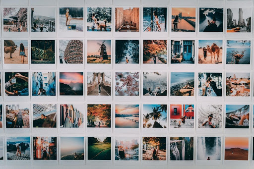
At the most basic level, a mood board is synonymous with a physical or digital collage constructed to convey a specific theme or mood. It can be based around shades of color just as easily around thematic images, photographs, shapes, words, and memorabilia to convey a feeling or an emotion to the website visitor. Usually constructed alongside the client, mood boards can be created several at a time. They are a chance for the designer and the client to work through the initial feelings about the project and solidify different viewpoints into common ground and create a foundational creative vocabulary at the start of the project. This can go a long way at streamlining the design process later in the workflow, as the designer is already in tune with the overall feel the client wants on the page and the design process can instead focus on creating the appropriate aesthetic.
Social Media and Other Platforms Where You Can Create A Mood board
As we reach the 4th quarter of 2020, the number of websites offering up the ability to create a mood board has grown significantly since the days of Pinterest. Below is a list of some of the most versatile boards on the web.
One of the original sites to allow users to create mood boards, it’s also one of the sites that’s easiest to use, provides a free board building application interface, and has an extremely active community. In addition to images and themes, the site is known for allowing users to create recipe boards, photography collections, and lifestyle collages.
Canva
Originally a design app, Canva includes templates for creating mood boards. The interface allows for drag-and-drop and can be accessed on a desktop through a website or on a mobile device through an app.
InVision
If you’re looking for something a little more commercial, InVision provides six different account types, including paid options that allow unlimited mood boards, tools to collaborate with team members and elicit feedback, and can be accessed across mobile devices and desktop computers.
Moodzer
Like the other tools in the list, you have the ability to create custom grids and layouts, drag and drop images, and resize images as needed. Unlike some of the other tools here, you can also include color overlays, apply filters, and also add typography to your work.
Honorable Mentions
In addition to those listed above, some other Social Media sites that allow you to build your own mood boards and provide various free and paid options include:
- Evernote
- Niice
- Milanote
- StudioBinder
- GoMoodBoard.
How Mood Boards Help in Planning Process for Website Design
Building out a website is a multi-tiered process, and requires website designers to take into consideration not only the branding of the client’s company, but also design trends in the relevant industry, popular color themes and the emotions they invoke, and even user interfaces and user experiences. Mood boards can help designers explore these components conceptually on several levels.
1. Set the Stage Through Competitor Analysis and Establish a Foundation Upon Which To Build
Starting with a blank slate can slow down the design process significantly. Designers can use a series of mood boards to lay out snapshots of competitor websites to see what works in the industry and identify common themes. More importantly, from such a high level, skilled designers can identify points in the various visual designs that they can accentuate in their own design and others that should be downplayed in order to capitalize on the best practices of others.
2. Mood Boards Create an Anchor in the Design Process
Every creative designer will reach a point in a project where they’ve followed their instincts too far down the rabbit hole and lost sight of the overall vision they set out to execute. Mood boards help set the path, and as the design process progresses, act as a visual landmark throughout that the designer can turn to as often as necessary to steer the project back on track.
3. Provide a Common Vocabulary and Visual Imagery For Collaboration
When collaborating with a team, mood boards can be powerful tools to provide visual baselines for discussing themes and design elements. Rather than fumbling for the right words to explain how a website should look or feel to the user, teams can use mood boards and the emotions they elicit to guide the design process more effectively.
4. Provides Direction and Inspiration When the Design Phase Falters
Inevitably, web designers will hit an impasse in the design process. Taking the time at the front end to create mood boards will provide a solid foundation and inspirational tool they can turn to at those moments where the process has come to a screeching halt for inspiration and guidance to kickstart the process back into motion.

